Dogmo Studios // work
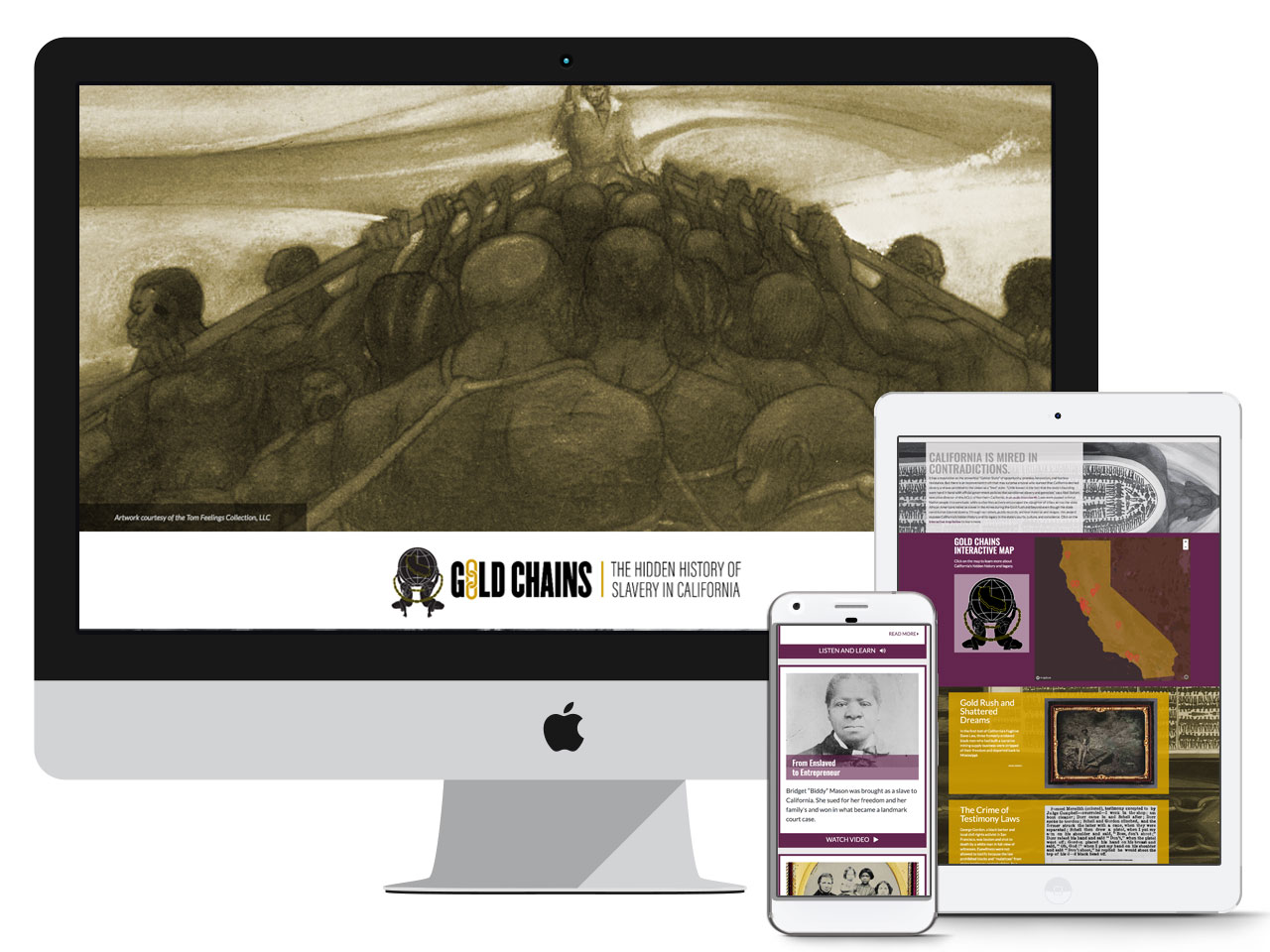
Gold Chains: The Hidden History of Slavery in California
UX Design, Front-end Design, Infographics
Gold Chains is a public education campaign that uncovers the hidden history of slavery in California. This multimedia project highlights stories of African American and Native American people who fought for due process and citizenship rights--stories that resonate in California today. In parallel with the 1619 project, Gold Chains connects us from the 400th anniversary of the arrival of enslaved Africans in Virginia to present day race-based violence and discrimination in California.
Working in collaboration with the ACLU of Northern California, we were honored to help uplift the narratives that connect the work of the ACLU to the movements that have come before us and continue to this day.
This responsive site was built using semantic HTML/SCSS, Mapbox API and JSON, and featured the art of Tom Feelings. We were responsible for UX Design, Front-end Design/Development, Social media, and Infographics.
ACLU: #Powerthe14th
UX Design, Front-end Design, Infographics
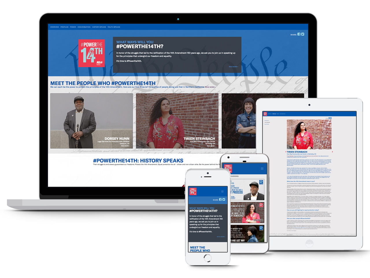
ACLU's #Powerthe14th Campaign is an ongoing collaboration honoring the legacy of the 14th Amendment. (The 14th Amendment turned 150 on July 9, 2018! Happy Birthday, 14th Amendment!)
Dogmo Studios was honored to partner with the ACLU of Northern California, Youth Radio, Underground*, and Lightbox Collaborative to highlight the 14th Amendment and its importance to the ongoing fight for equal citizenship, to uplift the voices protecting its promise, and to inspire us to join in and speak up.
Using agile best practices, we built a fast, responsive site in a week. We were responsible for all areas of UX/UI, responsive design, infographics, social media, and QA/testing. This site reflects the great work that comes from of the collaboration of a few enthusiastic and dedicated folks. With the liberal application of caffeine.
Little Passports
UX Design, Front-end Design
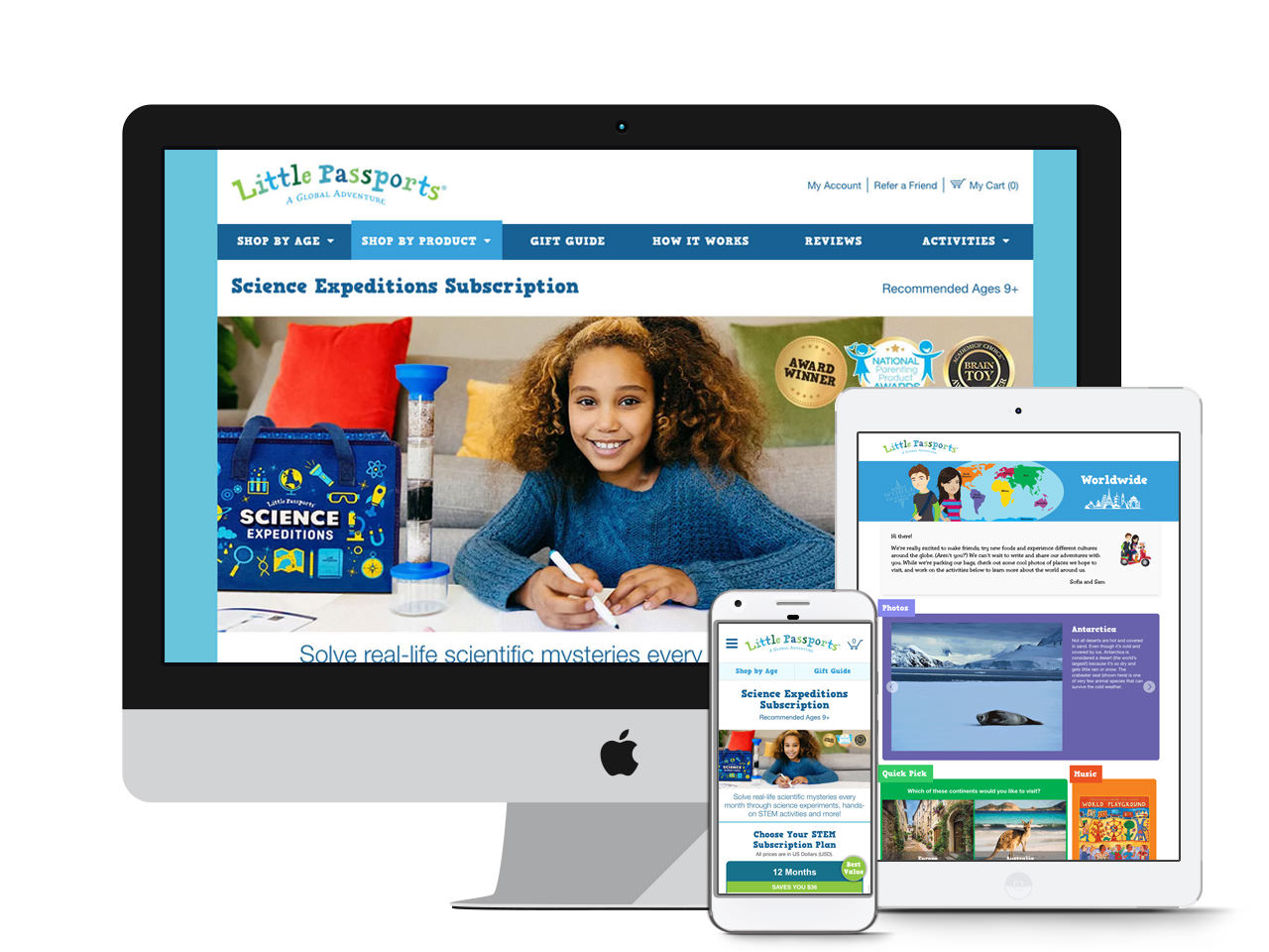
Little Passports is a small education-based company whose vision is to inspire children to learn about the world around them and become responsible/engaged global citizens.
During a time of dynamic growth, I was responsible for the integration of all levels of UX design for a rapidly growing children's brand and commerce platform; the creation of unique visual experiences for a variety of user-facing products; and management of cross-functional initiatives and priorities, resulting in immediate positive changes and the best holiday season on record.
Without a doubt, what I am most proud of is the fact that I quickly came to be seen as a valued contributor and partner to the other teams within the organization. It was a wild ride, and a wonderful experience to be able to work with great people doing good work.
Astraea Foundation's LGBTQ Racial Justice Fund
UX Design, Front-end Design
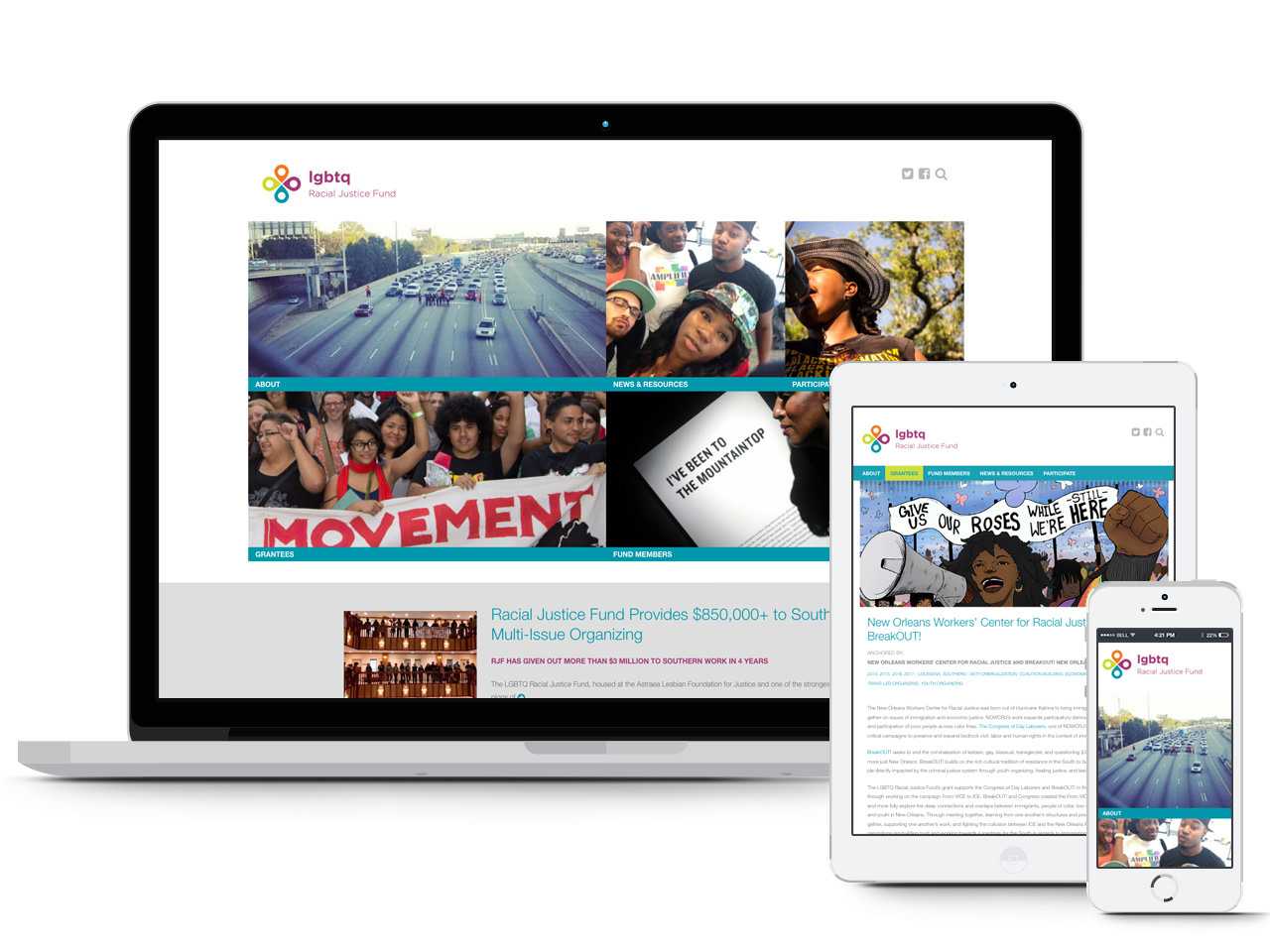
The LGBTQ Racial Justice Fund is a collaborative philanthropic initiative that recognizes inspired groups that are working across issues and movements for social change. In its first two years of grant-making, the Fund has provided more than $1,500,000 to grassroots organizations in the Southeast of the United States.
We were honored to work with them to build a new, fully responsive website with a custom Wordpress admin and theme. Our responsibilities covered the entire gamut of the project, from initial research and UX, to front-end design/development, to back-end development, and testing/QA.
Code for All Annual Report
Front-end Design, Annual Report, Case Studies
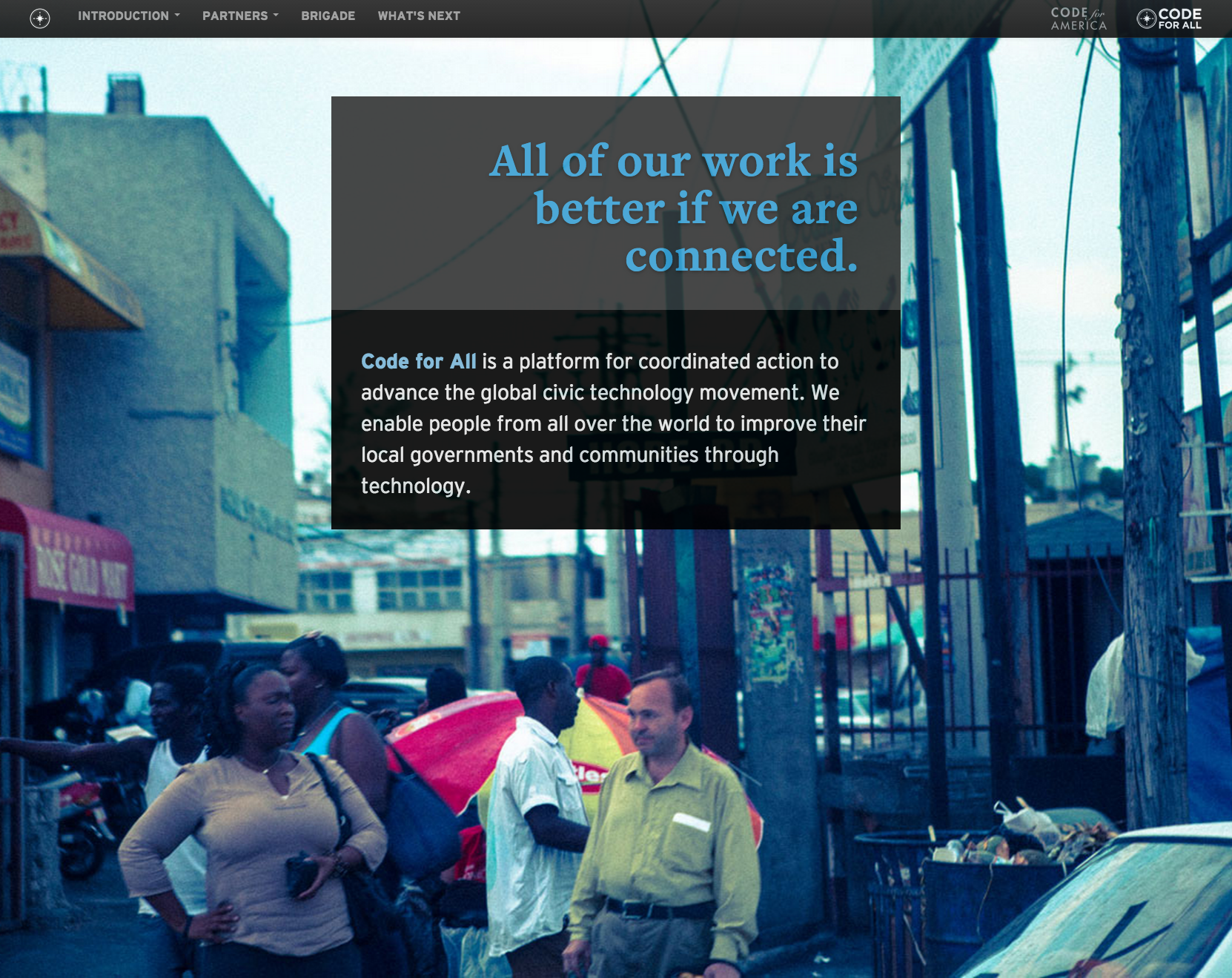
Code for America expanded internationally into Code for All, bringing their vision of harnessing “technology to solve community problems” on a global scale. We had the honor of working on their online annual report highlighting some of the incredible work they have done in their first year.
This project needed a quick turnaround, so we built the site using the Bootstrap framework (HTML/SASS) to create a responsive and visually rich site.
We also developed four case studies to highlight the incredible work they and their partners accomplished that year. For these case studies, we were responsible for creating a flexible white paper style layout to present the findings from each group. We settled on the PDF format because of its relative ease of use for both print and web.
Cal Alumni Association
Project Management, UX Design, Front-end Design
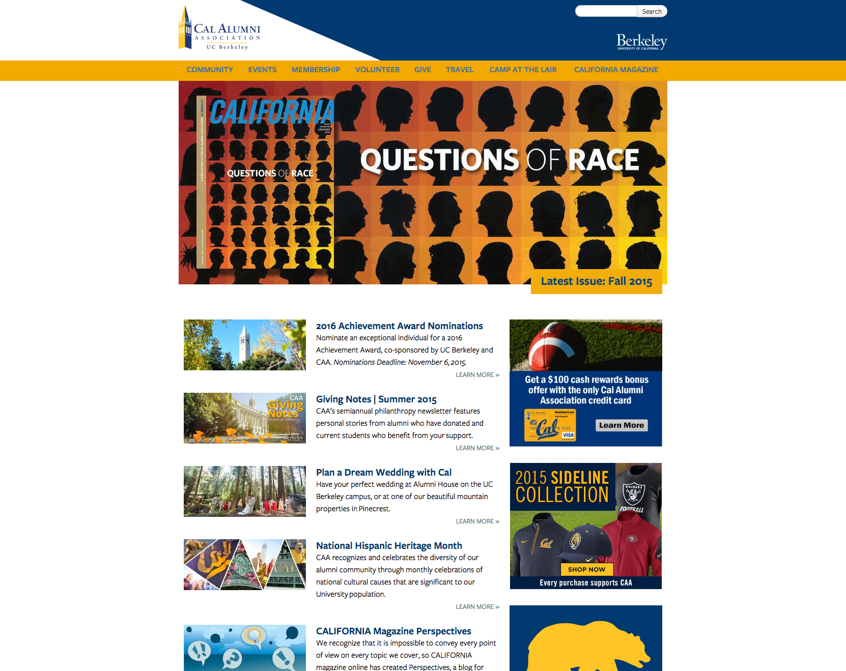
The CAA site was revamped to have a common look/feel, while still featuring custom design elements for the California Magazine and Lair sections of the site.
Our responsibilities included: project management, UX/UI, design, and front-end development. The custom back-end was built in-house using Drupal.
Working with CAA, we did extensive work to create three cohesive but distinct brands, complete with individual color palettes, font sets, and variations in site structure.
Federal Reserve Bank of San Francisco
UX Design, Front-end Design, Web Production
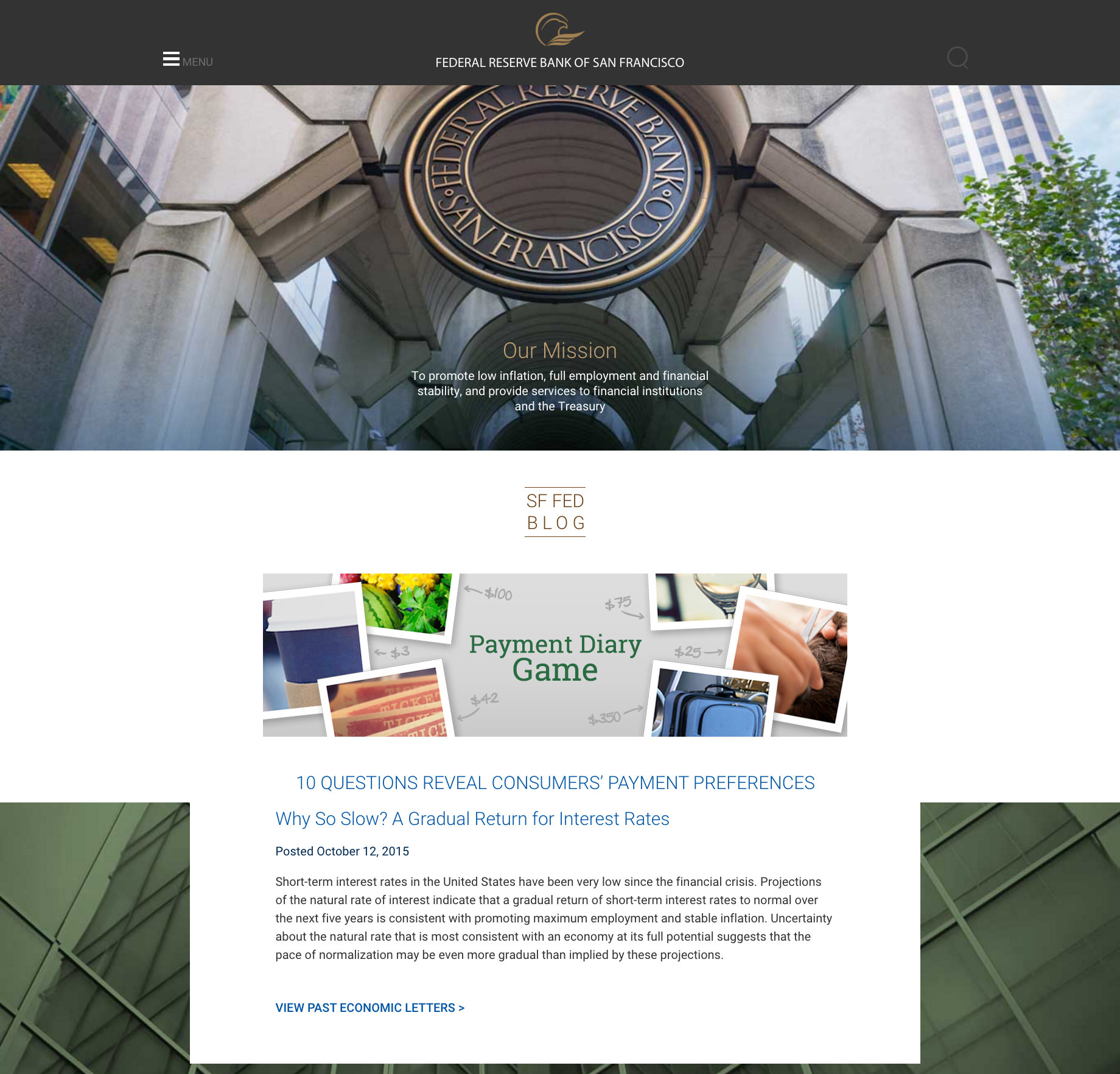
UX, Front-end design and development for the public facing websites for the Federal Reserve Bank of San Francisco.
Achievements included front-end design for interactive elements such as the payment diary game and the new #unreserved section of the site featuring human interest stories from within the SF Fed.
Other responsibilities included front-end design using HTML/SASS, creating graphics, managing content production, timing news releases, extensive browser and device testing, and QA/troubleshooting.
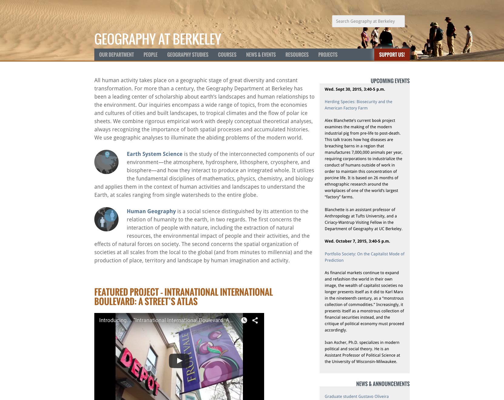
Geography at Berkeley
Project Management, UX Design, Front-end Development
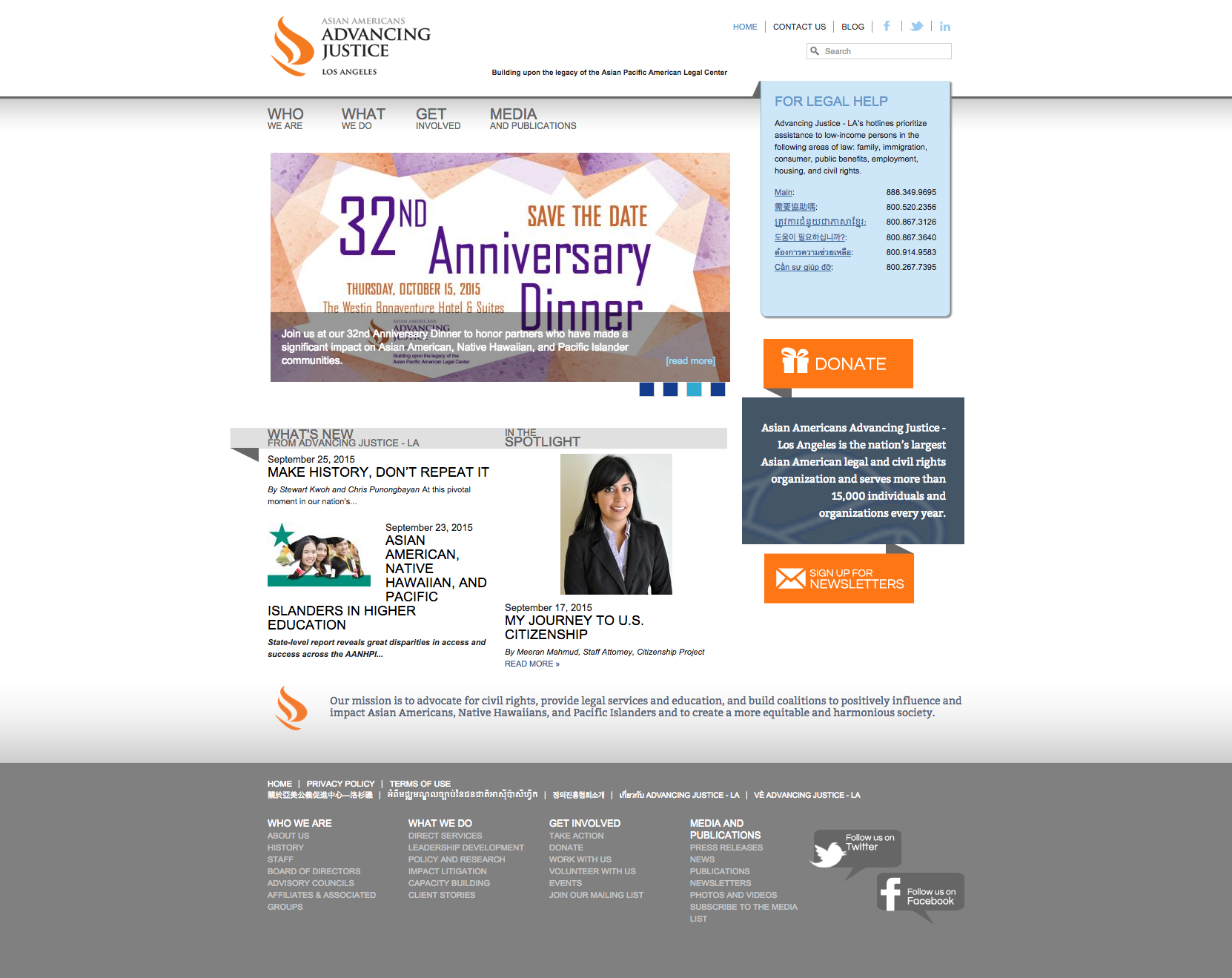
This project updated the Geography at Berkeley's website to be responsive and work with modern browsers and devices, while also moving them onto a custom Wordpress setup. Our team was responsible for all facets of the project from start to finish: project management, user stories/research, UX/UI design, and front-end development.
APALC
Project Management, UX Design, Front-end Design
This site involved a broad cross-section of voices and was one of the most successful design by committee projects we have ever worked on. The migration to Drupal was handled by Trestle Media. We were responsible for all stages of the project from exploratory/planning meetings with all levels of the APALC team, to project management and UX, to design and front-end development.
They have since rebranded as Advancing Justice - LA and kept the design we created.
Amnesty International
Poster, conference and event program materials
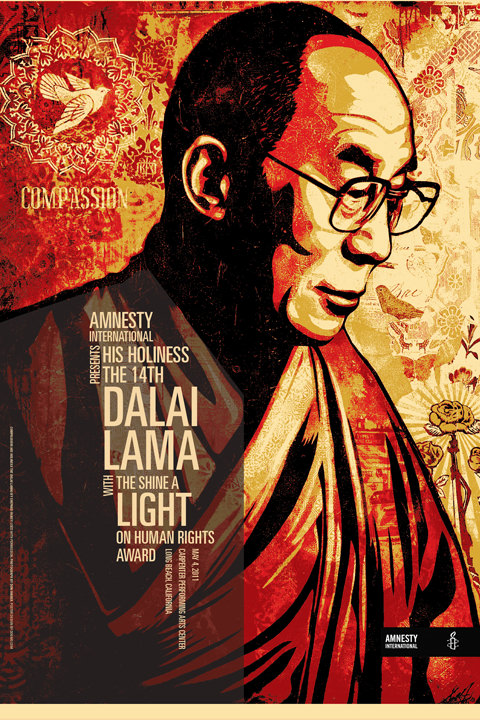
In addition to designing a variety of conference and program materials for Amnesty International, we had the opportunity to work with Shepard Fairey's illustration of His Holiness the Dalai Lama on materials for their event honoring him with a human rights award (including a beautiful poster and a billboard!).
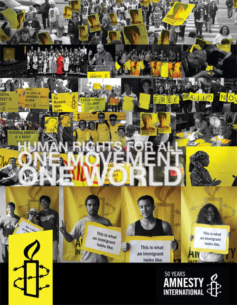
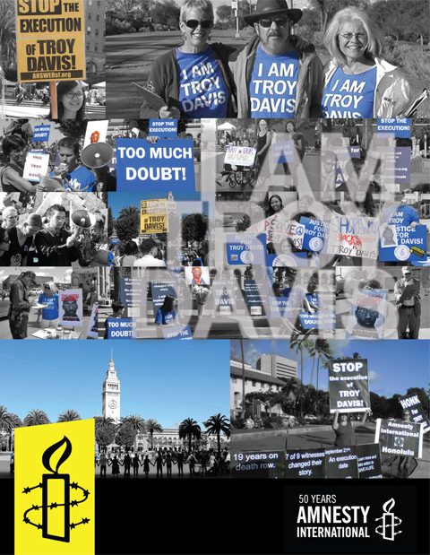
Pictured are three of our favorite components from these projects--the poster of HHDL and a couple layouts from their conference programs that felt particularly powerful.
For both projects, we were responsible for all levels of the project arc from project concept and development, to design, and final production.
View larger images:
Poster (JPG, 4 mb)
Program layout (JPG, 141 kb)
Program layout (JPG, 129 kb)
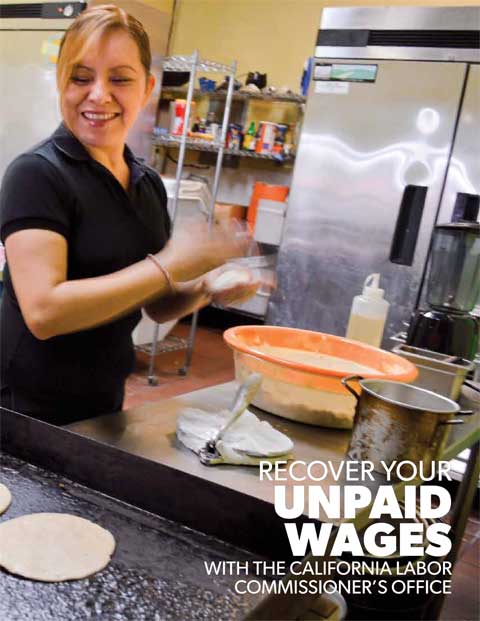
The California State Labor Commissioner's Office
Popular Education Materials: Brochures, Calendar, Infographics
Design of popular education materials for worker's rights. The California State Labor Commissioner's Office and the UCLA Labor Center hired us to design six large format brochures and a worker calendar, each translated into as many as six languages, all supporting the Labor Commissioner's campaign to reach as wide an audience as possible. (One example included below, more available on request.)
We started the project with a day-long kick off meeting that included a large group of the UCLA Labor Center staff and other stakeholders. After leading this meeting, we were responsible for all areas of the project: meetings with community organizers and the Labor Commissioner’s Office, UX/UI, project management, art direction of photos and photo editing, design, infographics, production, and proofing.
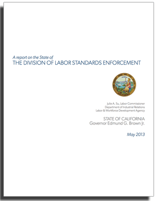
DLSE Report on the State of the Division
Report Design, Infographics
In two years, the State Labor Commissioner, Julie Su, instituted broad and effective changes to the DLSE. This report was created to highlight all the incredible work done by the Labor Commissioner’s office during that time.
Distilling the state-wide efforts and accomplishments of the Labor Commissioner and the DLSE staff was a fantastic challenge that required significant work to display a large quantity of data while calling attention to the accomplishments of this administration.
Creating this document required analysis and refinement of data into human-readable infographics, design, production, and proofing.
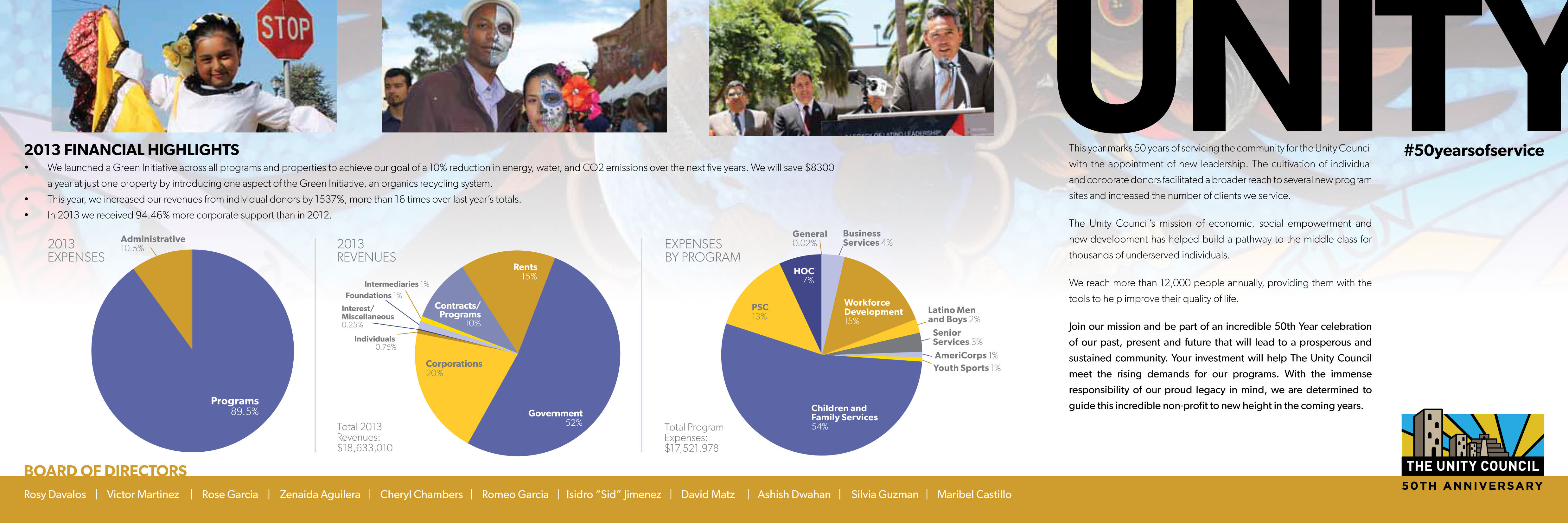
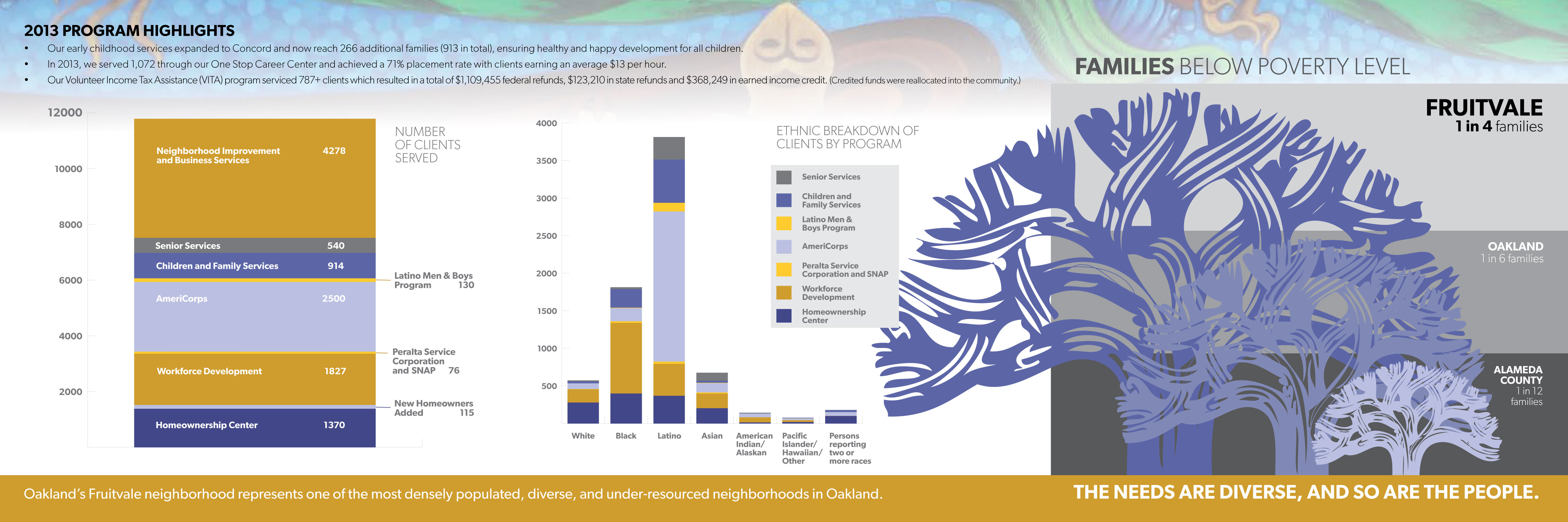
The Unity Council
Annual Report, Infographics
Creation of infographics and design of Unity Council's Annual Report.
Unlike many annual reports, we worked to create a different format that was compact and eye-catching to concisely convey the incredible breadth of the Unity Council's work in the community.
The end result was a compact tri-fold that distilled the data into a series of concise elements that conveyed the multiple facets of their story clearly and accurately.
KIPP School Profiles
White Paper Design, Infographics
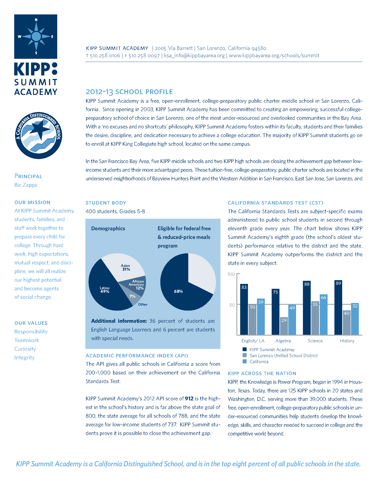
Update of design for KIPP's school profile sheets.
These double-sided profile sheets needed to encompass a large quantity of data and be flexible enough to use for each of their schools. We cleaned up the layouts and chart data to be as readable as possible.
NCOCA medal
Illustration, Design
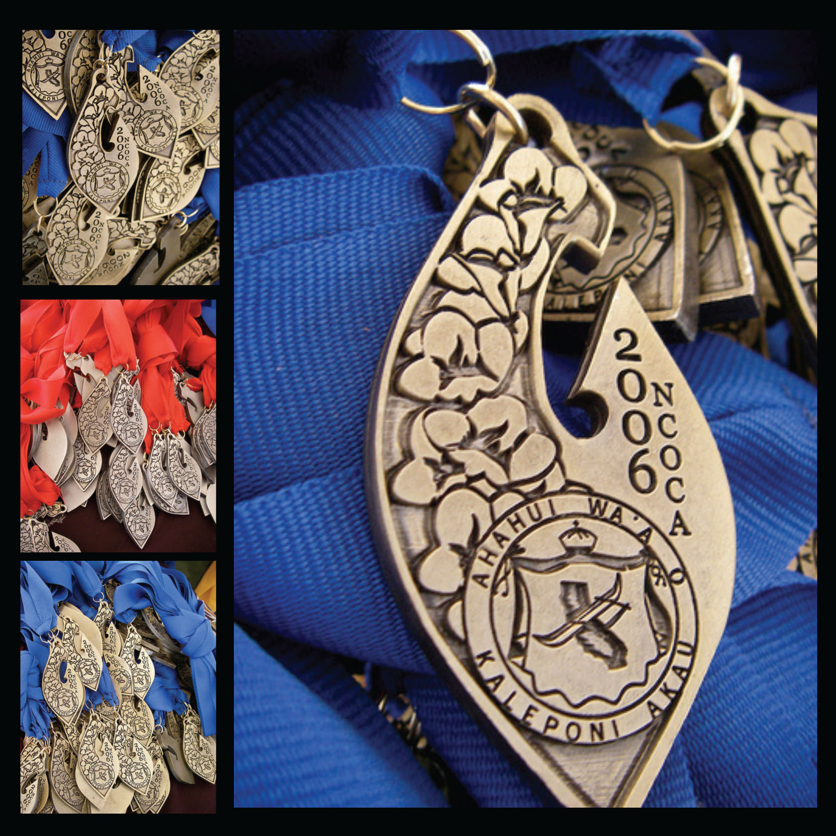
Development and design of the 2006 NCOCA Championship Medals.
Elements within the medal include: the California Poppy, the fish hook (for safety over water and to evoke the Hawaiian heritage of the sport), and the NCOCA (Northern California Outrigger Canoe Association) logo.
The design was hand-drawn in Adobe Illustrator and in order to get a sample to keep, I had to win a championship race. (Yep, I got first place...phew!)
826 Valencia: Field Trip Program
Illustration
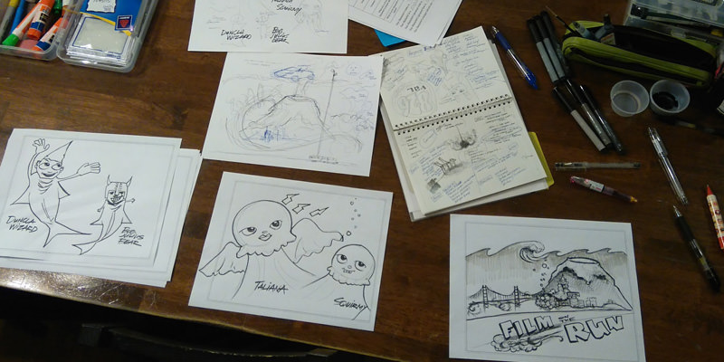
Possibly the most frantic fun illustration gig ever.
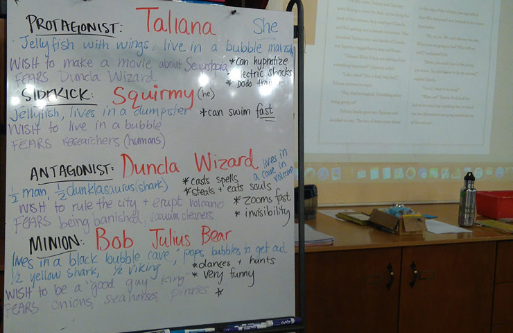
In two hours, a group of elementary students developed an entire story--complete with protagonist, antagonist, supporting characters, and a narrative full of intrigue and suspense.
There is nothing like trying to draw a city located inside a volcano inside a coral reef with the San Francisco skyline--with houses made of bubbles, offices made of coral, and bridges made of kelp (the kelp makes the Maseratis made of seashells wrapped in seaweed go faster).
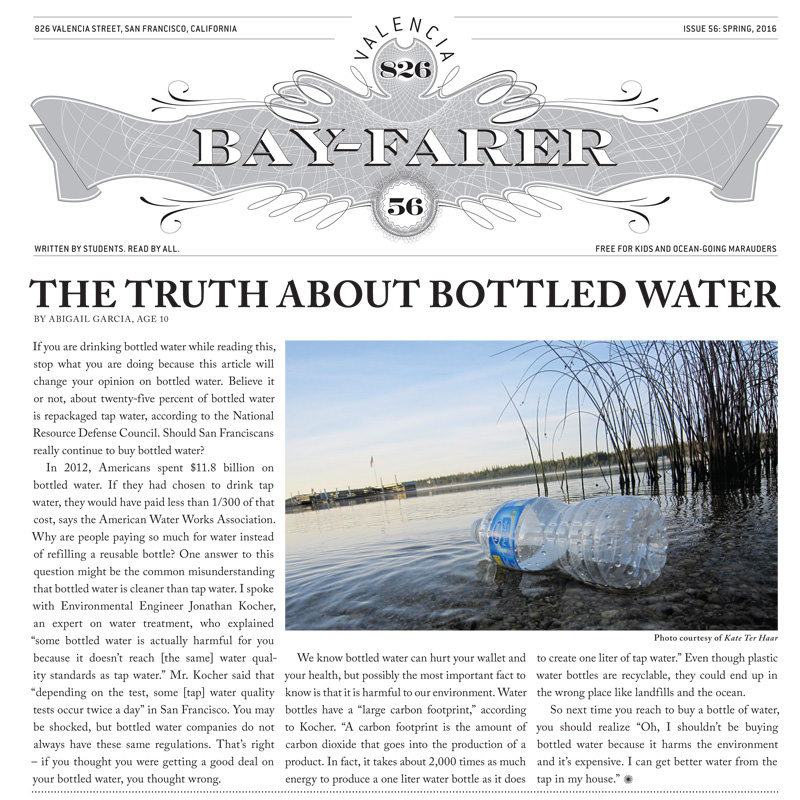
Valencia Bay-farer
Newspaper production
The Valencia Bay-farer is an in-house newspaper created by a group of young journalists (ranging between the ages of eight and thirteen) as a part of 826 Valencia's fantastic writing programs.
Working closely with their design department, this paper required a very tight production schedule, with a turnaround of less than a week for everything from layout to copyedits to printing. Main tasks included print production and photo sourcing.

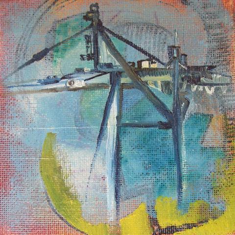
Paintings
Obtaining a Bachelor of Arts in Fine Arts from Amherst College helped to establish a strong foundation in painting, printmaking, and illustration. (Naturally, this lead to a diverse and economically challenging series of positions in food service and retail.)
Currently, my creative practice uses landscape to explore the interactions between community, time, and memory. Or something. (Edit, full disclosure, I am becoming something of a conceptual artist: I think about art more than I create it...)
Prior to all this, as an infant at my Tol (돌) ceremony, I grabbed a pen and have spent the rest of my life living up to it.
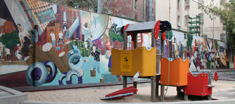
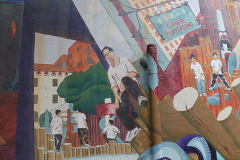
Murals
As a muralist, I have worked on a number of murals within the Bay Area, most extensively on the mural shown above (there is a nice, if inaccurate, article about it here).
For a couple years, I had the spectacular luck to participate on a number of Precita Eyes' murals in San Francisco. It is something else to have bits pieces scattered about the city...
Sketchbooks
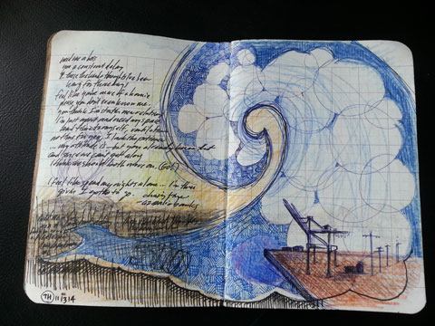
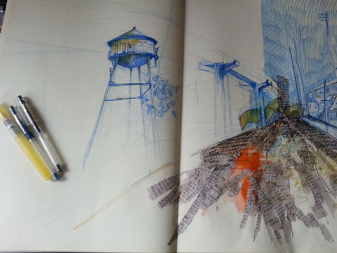
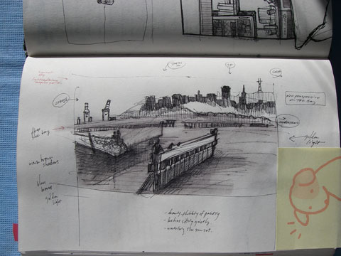
"Keepers of private notebooks are a different breed altogether, lonely and resistant rearrangers of things, anxious malcontents, children afflicted apparently at birth with some presentiment of loss." -Joan Didion
(Malcontent or no, I have always got a notebook and pen(s) on me.)


